Making your investment in Slate portals pay off
A few weeks ago, a user posted to the r/ApplyingToCollege subreddit asking fellow Redditors which schools’ application portals stood out, and the responses were exactly what you’d expect from Reddit: a blend of useful insights and brutal honesty, all seasoned with a heavy dose of attitude. (By the way, if you aren’t monitoring r/ApplyingToCollege, you’re missing out on a key opportunity to learn exactly what your target audience thinks and wants.) While the discussion thread provided very detailed feedback for some specific schools, most of the opinions expressed would be valuable to any of us hoping to improve the ways we communicate with our applicants and admitted students. The overall message these students expressed? They’re looking for clean design, clear next steps, intuitive navigation, and enough personality to not feel generic. This discussion thread is yet another reiteration of what we’ve witnessed at RHB over the past few years: for schools using Slate, portals are one of the most promising and essential ways to distinguish your institution with your most important audience.
Let’s back up a step or two here. If you’ve had the good fortune of living under a rock for the past two years, lucky you! You’ve missed a ton of grief and anxiety. But you also missed the advent of a great new tool: the Slate portal.
Assuming this is news, portals are akin to what you used to think of when you described a microsite or personalized webpage. A portal is a powerful tool to link and populate a web page with data drawn from Slate (or other CRM or data source) to personalize the user experience at any particular moment in time or process. Portals allow users (institutions and their customers) to monitor and manage data and progress toward process completion points.
Portals serve both internal and external users. Internal audiences such as athletic coaches or department chairs can be granted access to a portal to manage recruitment efforts for their subsets of prospects. Alumni directors can benefit from portals to monitor connections and engagement among former students. You can easily imagine how useful and helpful portals can be for your customers. Portals provide clear paths toward enrollment by delivering data relevant to each user such as progress toward completing admission requirements, registration and forms of all transactional types (health, housing, insurance, automobile registrations and the like). Of course, this reduces, if not eliminates, direct mail and its accompanying costs and confusion. Rather than a deluge of requests from a variety of offices and departments across your campus, a portal can centralize these appeals in a singular, organized site—all tailored to the specifics of each student.
While there are certainly cost advantages to building portals, they’re not free; you’ll have time and money expenditures. Still, the efficiency and cost-effectiveness of portals should not go unnoticed. You’ll need to make good choices as you develop portals and a good place to begin is to articulate what you want the portal to do and who you want to serve with it.
Slate delivers great tools and templates to build portals. They’re not exactly plug-and-play, but the templates will help you sort through the choices you’ll need to make and provide direction about how to build forms and link data. Generally, for internal audiences, portals don’t need to be particularly lovely. Clarity and ease of use will be primary drivers, that is, making it comfortable, accessible and easy to learn for coaches or other partners across your campus. You want to create a site that compels users. Internal portals are not necessarily where you want to invest time or money in making them aesthetically pleasing.
Portals developed for external audiences, on the other hand, need to be beautiful and an accurate reflection of your institution. And an out-of-the-box portal template won’t do that trick. Even if you carefully place your logo in the corner, the portal template won’t make the most of the experience or your opportunity to make an amazing impression or convey your amazing story.
Portals, frankly, should support, illustrate, reinforce and magnify your positioning. How you present information, ask questions, create forms, style the page and illustrate your message should be designed—nay, tailored—to fit your institution and only your institution.
We’re reminded of a similar pattern with search strategies. Not too many years ago, there was a big behemoth vendor who generated the bulk of search strategies and mailers. Their formula was proven and tested, but the trouble was, it was a formula that came across to prospects as formulaic (which, by the way, the kids over at r/ApplyingToCollege have also caught on to). On any given day, a prospect could anticipate receiving perhaps dozens of search mailings that looked entirely too similar to be trusted as authentic appeals from the institution. A templated approach wore out its welcome—in mailboxes of customers and in budget line items at institutions. Eventually campuses caught on and we’ve all observed a movement away from utilizing not only that vendor, but those tactics.
As you develop your portal, plan to distinguish your institution from the scores of others who use the same technology. On one hand, your savvy market knows technology sufficiently to expect you (as a center of higher learning!) to make the most of it. They are disillusioned if you don’t use technologies to personalize the experience. Yet your user experience needs to differentiate you from others who employ similar strategies and tools.
Here are some key opportunities to utilize portals to engage with students across the funnel, improve efficiency in your internal business processes, provide non-Slate users with the data they need in a secure manner, and otherwise optimize your CRM strategy.
Application Status Portal
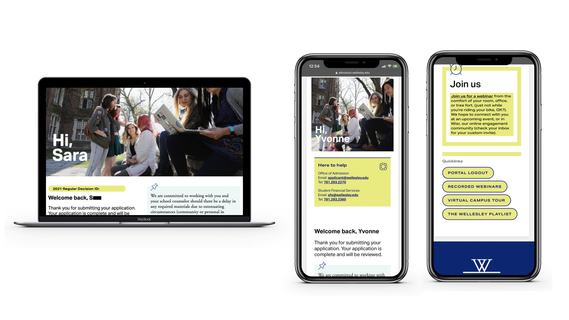
The portal that started it all. All Slate schools have access to, at a minimum, an applicant status page, where students can view their checklist, upload documents and view their admissions decision. But we can go far beyond the baseline here, providing students with opportunities to do more, such as register for an interview, view financial aid checklists or see when their admissions counselor will be in the area. Your application status portal will create a strong impression for many of your prospective students—make sure to put your best foot forward here. Wellesley College’s portal, which received high praise in the subreddit thread mentioned at the beginning of this piece, features easy access to recorded webinars, a virtual tour and events in the student’s area. Students can also request an alumni interview, review their financial aid checklist, submit a request to withdraw their application, and watch dozens of videos highlighting the Wellesley experience.

Admitted Student Portal
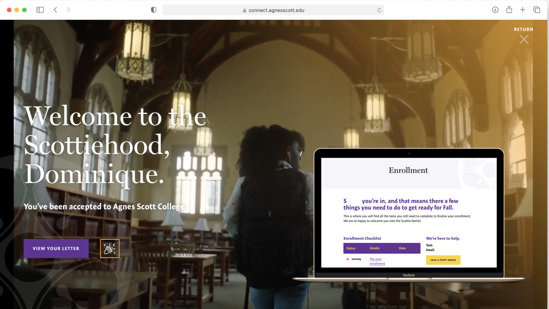
While many schools choose to utilize the status portal for both applicants and admits, creating a unique experience for your admitted students can be a powerful opportunity to influence conversion. Use your admitted student portal to build a personal connection with your admits by presenting content related to their major of interest, highlighting specialized scholarships that they might be eligible for, or contact their counselor directly via a form embed. Agnes Scott College’s admitted student portal provides each student with information on their intended major, highlights important upcoming dates, and walks them through the financial aid process. And all of this is presented with plenty of personalized content, such as a message from the student’s admission counselor, to create an experience that feels relational rather than transactional.

Search Portal
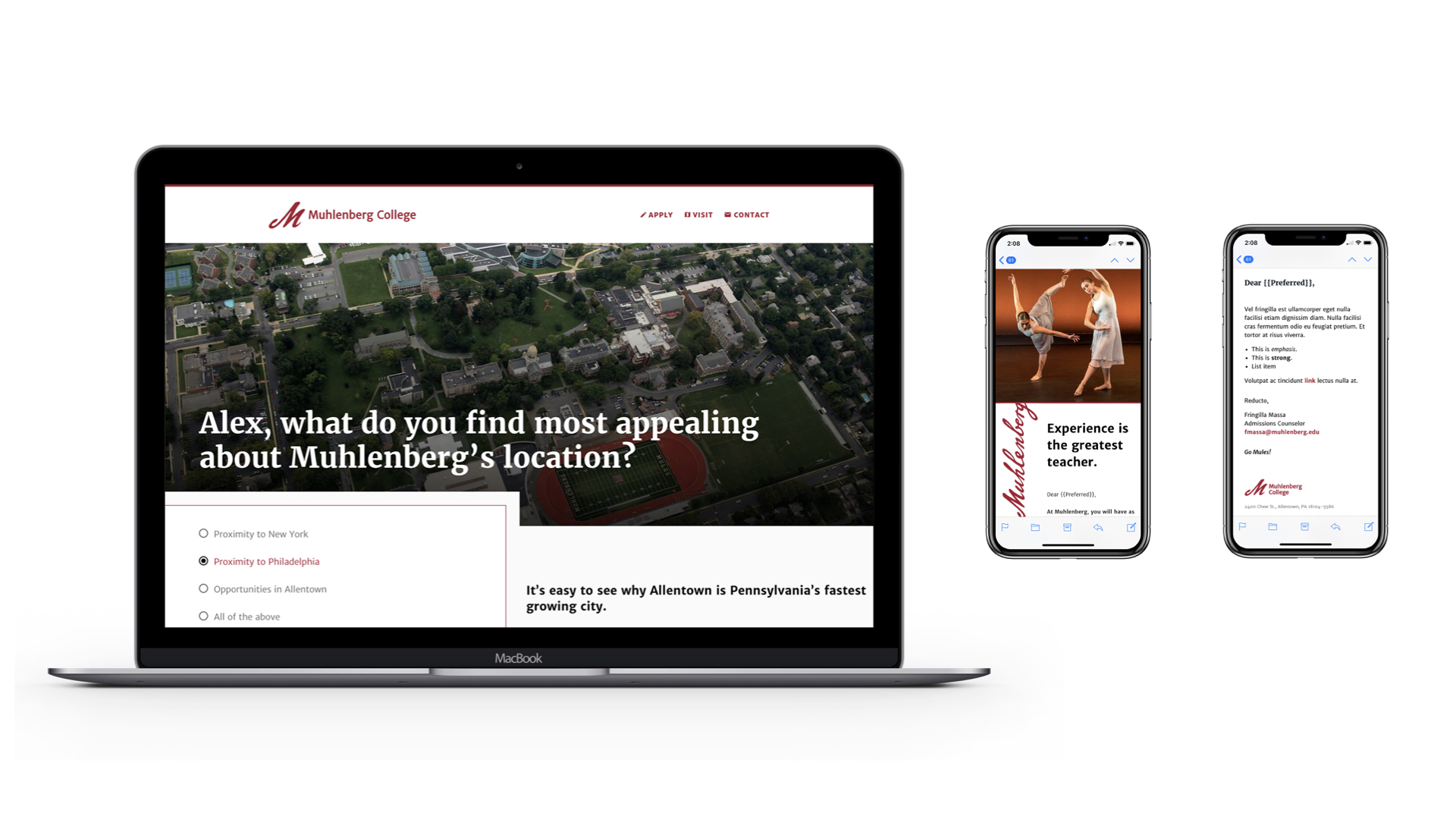
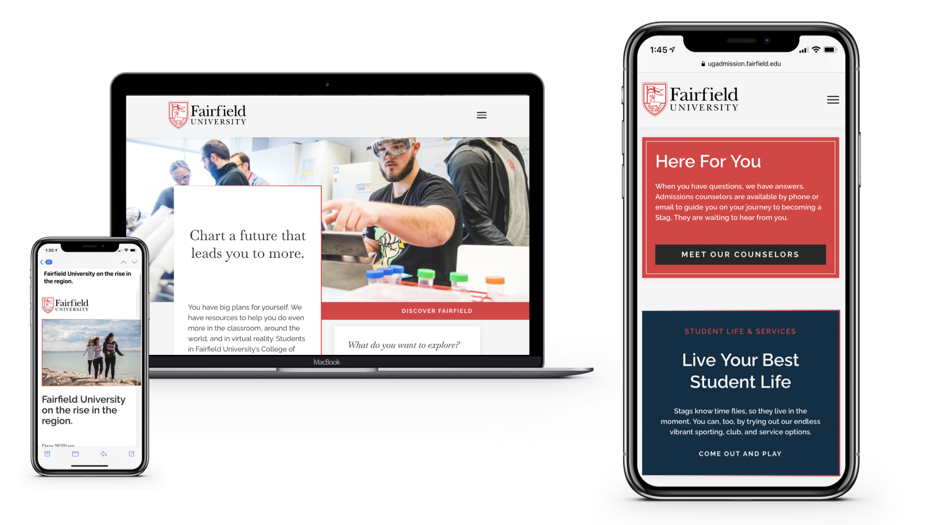
If you’re considering bringing your Search process in-house (or if you already are!), a Search portal creates a coherent, robust experience for your leads. Link your Search emails to a person-scoped portal where prospects can submit a responder form and explore relevant content based upon their profile. Fairfield University’s Search emails drive their prospects to a portal that displays different content based upon the message that the students click. Each of the ten views highlights a different school characteristic, and mailing snippets and translation codes allow the content to be personalized based upon various student data points such as intended major and geographical region. At Muhlenberg College in Pennsylvania, they utilized a series branded and unbranded emails to drive students to an inquiry portal they could take a short quiz around key messages in order to drive engagement.


Alumni Interview Portal
Candidates for admission receive an assignment for an alumni interviewer, who manages interaction with their assigned students via a private, and secure portal. Added functionality for a captain-based system, where interviewers have a fellow alum managing a territory or region of interviewers, creates not only a remarkable portal experience but also allows you to shift pieces of the internal management of your interviewers to an untapped bank of support from captains. This not only fosters a smooth and organized experience for your admission applicants but also taps into your alumni cohort and engages it in a unique, meaningful way. For instance, at Babson College alumni are able to access training manuals, view the details for each student they are scheduled to interview and submit evaluations, while staff and captains can easily assign students to these volunteers and see a summary of all interviews by alumnus.
Campus Visit Portal
Personalize a campus visit experience with a portal where registrants can review their registrations, complete surveys for events, check out offerings for other future events and more. These types of portals allow for you to shift heavy content from various confirmation and reminder emails that might be lost or deleted (like check-in protocols and parking information) and organize them in a place where a student can easily retrieve them anytime. Beyond the sophistication of providing personalized content relative to prospective student events, you can use this portal to drive the student toward application.
Overnight Hosting Portal
Utilize a student committee group to make assigned matches between prospective and current students for hosted visits. Really, this example extends to any work you may have student workers or volunteers executing for your office. Remove the legwork that comes with trading spreadsheets, isolating data in cloud systems and losing track of progress by building a portal that serves up the right information for the process to take place directly in Slate (or your CRM).
Class List Management Portal
Allow university faculty to self-manage a publicly available list of classes available for prospective students to visit during a campus visit. Much as with the student example, capitalize on the power of portals to remove repetitive, manual trading and management of your data, and let your system make the process more self-sustaining by shifting who does the work. Load a list of faculty and their courses for a semester, and provide a simple portal for managing whether those courses are published, special notes visitors need to read, dates visitors should not come, and anything else relevant to your environment. A companion public-facing portal displays an interactive, filterable and searchable list of courses.
Recruitment & Territory Management Portal
Custom-tailor the powerful tools in Slate (or your CRM) into a very focused collection of the queries, reports, dashboards and other modalities your officers use for recruitment and territory management. Utilize a Territories dataset to supercharge the relationship between student records and staff assignments, creating valuable analytical insights into your recruitment data served up without the manual steps of exporting and churning on data. How often are officers pouring through a set of disjointed queries, reports and event lists to manage their recruitment work? Curate and unify the tools through a portal—both your internal user experience with and execution of those recruitment steps will be more consistent and approachable.
If this list leaves you wondering, “What processes and experiences could we improve with a portal?” you’re asking the right question—and from our perspective, the answer is “pretty much anything.” Slate portals present tremendous potential for your institution, and by investing in this tool, you’re building a more user-centric, effective and sustainable resource that has the power to transform your recruitment and operations. So whether you plan to build your portals in-house or hire experts to help, now’s a great time to roll up your sleeves, define your portal priorities and then take the steps to put them into action. We promise: you’ll be glad you did.

