The “Design Squiggle” and Crafting an Experience in Slate
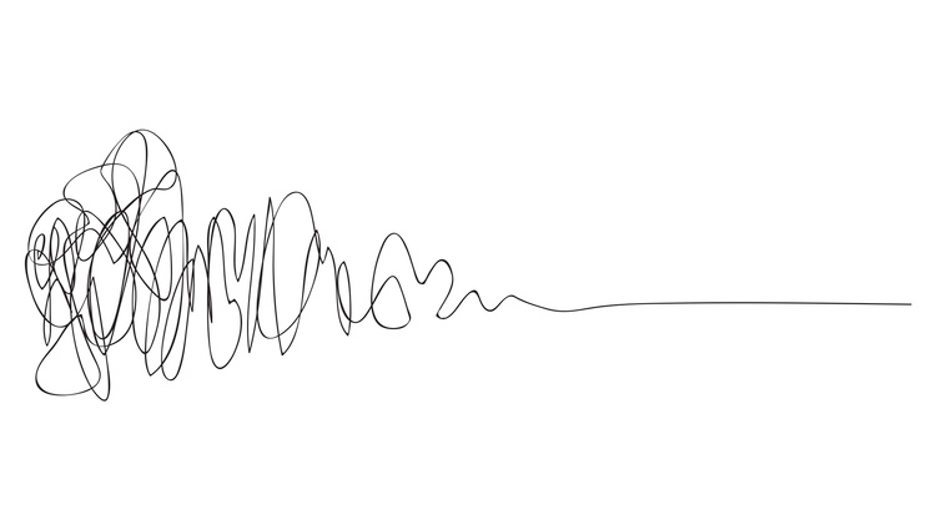
Shortly after her start at RHB, my colleague Erin Gore shared with all of us a gnarly-looking illustration:
(The Process of Design Squiggle by Damien Newman, thedesignsquiggle.com)
Titled The Design Squiggle, it looks quite a bit like the signatures I saw from students in my prior work in secondary education: adolescents more familiar with the click-clack of a screen or keyboard over the fluid movement of a pen or pencil. I recall the portion of the SAT (that I now believe is gone?) where students were asked to, paraphrasing, “sign your name as you would on an official document,” prompting increasing hand-raises each subsequent time I proctored that gauntlet. “But what does that mean?,” they pleaded. (As proctors we always had to verify completion on each answer form before dismissing everyone, and I empathized with anyone who attempted to decipher the scribbles.)
Back to this current Squiggle. Does it evoke anything in particular for you?
Chaos? Confusion? Anxiety? Frustration? Hapless doodling?
Does it feel creative and inspiring? Meaningless and puzzling?
As you can read in Damien Newman’s short history lesson, his Squiggle attempts to communicate the value of the design process. He found folks he worked for had faint interest in the earlier steps that lead toward execution or end implementation of an idea. Surely we have all found ourselves in that position at least once:
-
- “When can this be done already?”
- “We only have X days to get to Y solution.”
- “It just needs to function.”
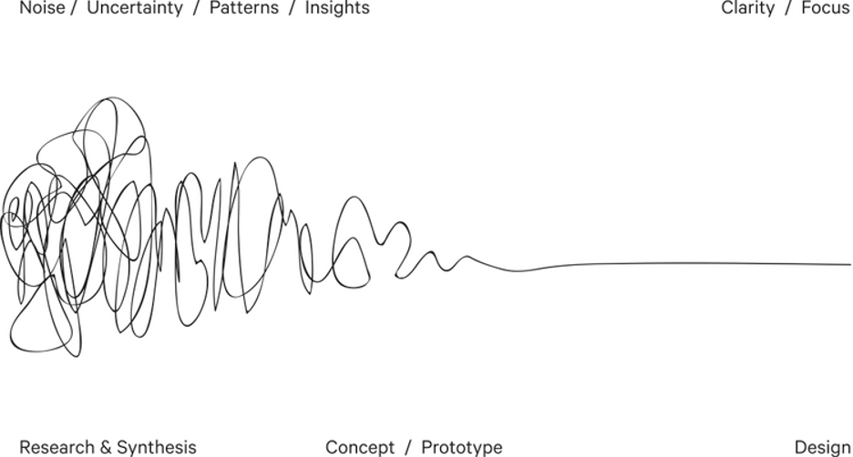
Consider this additional view of Newman’s Squiggle with his two axes …

(The Process of Design Squiggle by Damien Newman, thedesignsquiggle.com)
… and reflect on the work you undertook to implement your Slate database. Forms, Applications, Reader (!!), Deliver Mailings, Rules: feeling a little reminiscently ‘squiggly’?
I bet you could draw your own Squiggle for those modules and more, each with varying degrees of noise and uncertainty and different timeline lengths from research to concept through design.
The design processes for Portals in Slate are no exception to this process; I’d posit that they vie with Reader for top-ranking of the potentially noisiest and most uncertain, requiring deep-dives of research and synthesis. This rings even more true when you consider something we especially believe at RHB: that Portals are a means to an experience. A Portal is a vehicle through the design process, and the resulting product is an experience.
Again, you—and those leading you in the organization—might tend to hyperfocus on the end result (“We need a Portal to do X, Y and Z by decision release.”). Concrete deadlines aren’t going anywhere, I’m afraid. However, if you embrace this notion of the design process as the journey of the Squiggle, you open yourself to the opportunity to create a transformative, coherent experience for an audience, brought about by the vehicle of a Portal in Slate.
Your Squiggle for crafting an experience through a Slate Portal will not be linear. But, if you’re methodical about some key factors of the design process, you can minimize the amplitude of the noise waves and the number of times—and how far—you digress from clarity and focus.
Perform Discovery
| Squiggle Stage | Squiggle Characteristics |
|---|---|
| Research & Synthesis | Noisy, Uncertain |
- If you have known dates, deadlines, checkpoints and other constraints (time-based or otherwise), plot those boundaries out.
- Have dedicated brainstorming conversations to brainstorming (remember, the spirit of brainstorming is to reject no idea). Entertain those “what if” moments—those may lead to “what is.”
- Include all stakeholders in discussions about hopes and dreams, as well as pain points and firm processes. Speak with end users of the current experience so that you build for rather than impart upon your audience.
- With everything in mind of what you want the experience to be, be prepared to make tough recommendations or decisions about the design process timeline that leave you with enough runway to be successful. No problem with being quick, but hurrying is a red flag.
Design and Build
| Squiggle Stage | Squiggle Characteristics |
|---|---|
| Concept / Prototype | Patterns identified, insights analyzed and synthesized |
- Identify your capabilities and needed resources: would crafting this experience benefit from a skilled web designer with HTML and CSS background? (Spoiler: yes, almost always.) Does a Slate Captain need to spend time with the Slate Knowledgebase developing a greater understanding of certain Portal methodology that serves to inform what can be created? (Again: yes.)
- The output of your discovery process should lead to puzzle pieces on the table. Before reaching for tactical tools in Slate, arrange those pieces several different ways. What do they reveal about themes? About function and transaction? About information, content and copy? About hierarchy, organization and navigation?
- Build in incremental steps relative to the sophistication of the project and the number of stakeholders.
- Build with the future in mind: scrutinize places where surgically-specific configuration is necessary (like certain exports and filters), versus those that can be made evergreen without bloat to cycle prep or load on annual preparations and rollovers.
Test, Reflect and Refine
| Squiggle Stage | Squiggle Characteristics |
|---|---|
| Design | Clarity, Focus, Coherence |
- Walk through the experience wearing the lenses of several different types of end users in the intended audience: does it equitably meet the totality of needs for each user at each point through their journey?
- How’d you account for and place all the puzzle pieces from discovery? Is the experience clear, focused, functional, performant and coherent in all the ways it needs to be? (No one likes finding a bug or an unturned stone that could have otherwise been resolved with thorough testing.)
- Amplify testing efforts by using others on the team. Review, revise and refine. Don’t rely on the end-user audience to do that for you with a live product.
- Pull initial stakeholders who provided input back into the equation: “Here’s our resulting output based on what we heard you describe. Does this impact your experience differently than before?”
Ultimately, focus on and champion the student experience—or whomever comprise the end-user audience—throughout the design process. If you descend into over-complication or conversations mired in weeds and details, chances are good you’re facing too inwardly. It’s easy to do, since we have frame-of-reference for fine details that the audience never sees or encounters. Face outward, and diligently frame and reframe to elevate the student experience. When you make that the gambit, your design process will be most effective.
Make a place where you can draw and update your Squiggle real-time as your project unfolds. How and where does it change, and why? I’d be interested to see how yours turns out.

